/Case Study
Defendify
Reimagining cybersecurity as a guided, human-centered experience for modern organizations.
For many small and midsize organizations, cybersecurity feels overwhelming: unfamiliar terminology, scattered tools, and no clear sense of where to start. Defendify changes that by offering a single, guided platform that simplifies the complexity. It meets users where they are, helps them build confidence step by step, and turns cybersecurity from something intimidating into something understandable and achievable.
From scratch
Overview
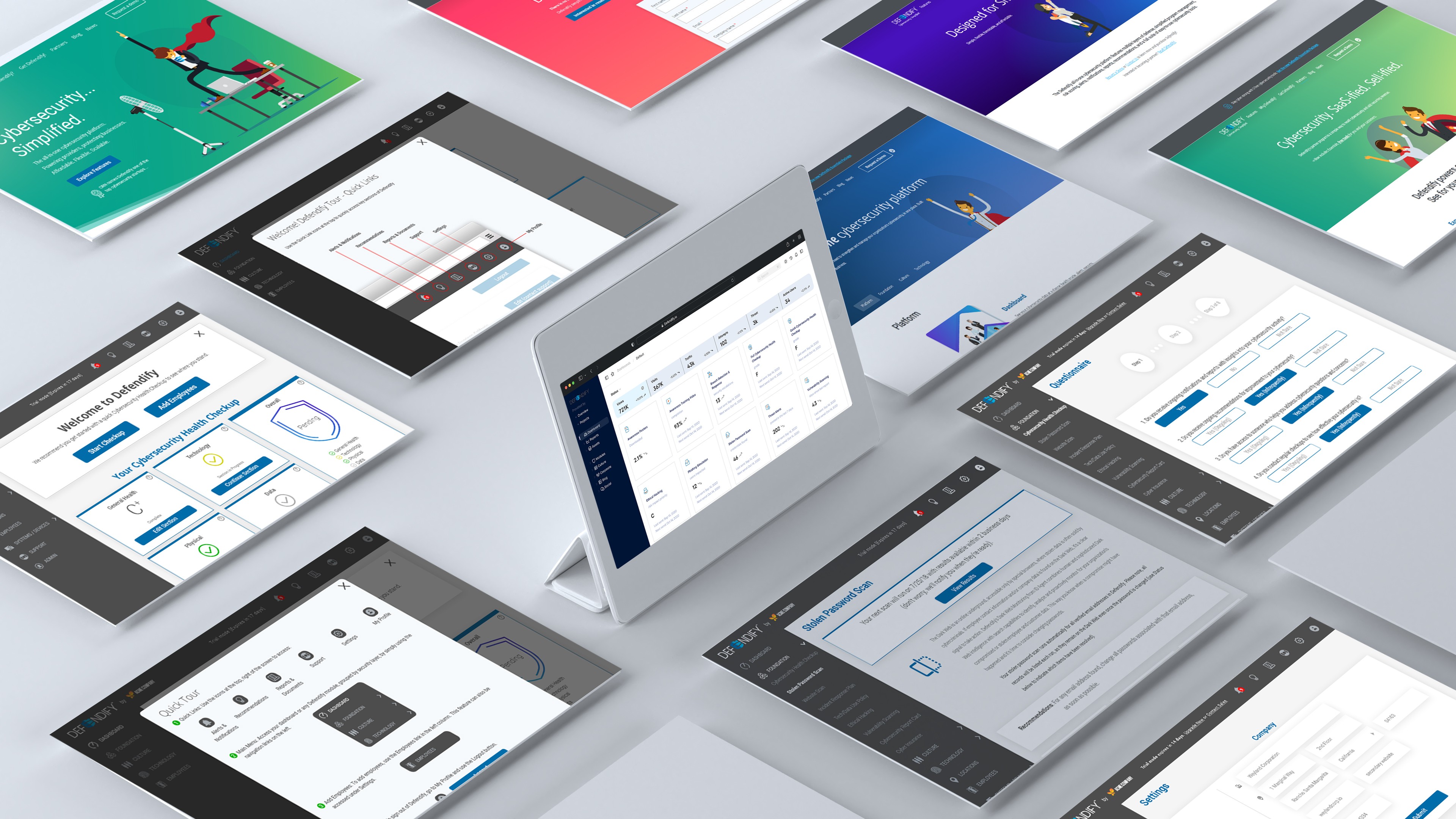
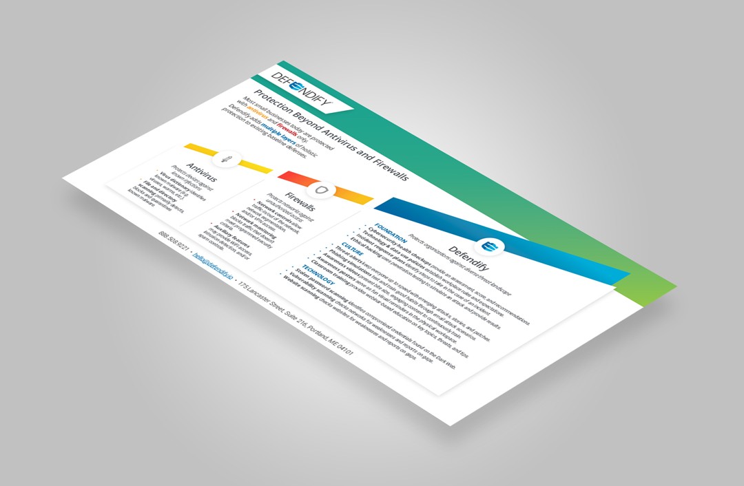
Defendify is an all-in-one cybersecurity platform designed to help organizations who don’t have in-house security staff build and maintain a strong cybersecurity posture. As the Principal Product Designer, I led the end-to-end product experience — from defining the initial product foundation, through the MVP and first public release, to the continued evolution of the platform's interface, workflows, navigation, and brand identity.
This included designing the platform architecture, dashboard, tool modules, UI system, iconography, and overall visual language that would become core to Defendify’s identity as a cybersecurity platform approachable to non-technical teams.
The Challenge
Small and mid-sized organizations face increasing cybersecurity risks but lack security teams, vocabulary, and time. Most cybersecurity software in the market is designed for specialists — using complex dashboards, abstract scoring systems, and deep configuration layers that assume technical proficiency.
For many organizations:
Cybersecurity feels intimidating
The risks seem abstract or invisible
Security tools feel built for someone else
The core challenge was to make cybersecurity understandable and actionable, without oversimplifying it.
Goal: Close the psychological and functional gap between “I know I should care about security” and “I can take confident action.”
Design Goals
Reduce cognitive intimidation by simplifying language and UI complexity.
Guide users toward clarity — what’s important, why it matters, and what to do next.
Create a sense of progress and empowerment, not fear.
Unify multiple cybersecurity tools into one cohesive experience with a shared mental model.
Understanding the User
I worked closely with:
IT Managers wearing multiple hats
Office administrators suddenly responsible for security
Business owners with limited technical background
Key Insights:
Users needed plain language, not cybersecurity jargon
They wanted to know what to do next, not sift through dashboards
Confidence mattered as much as capability
This informed a product strategy that emphasized:
Clear recommendations
Designed pathways
Visual assessment of security posture
Approach
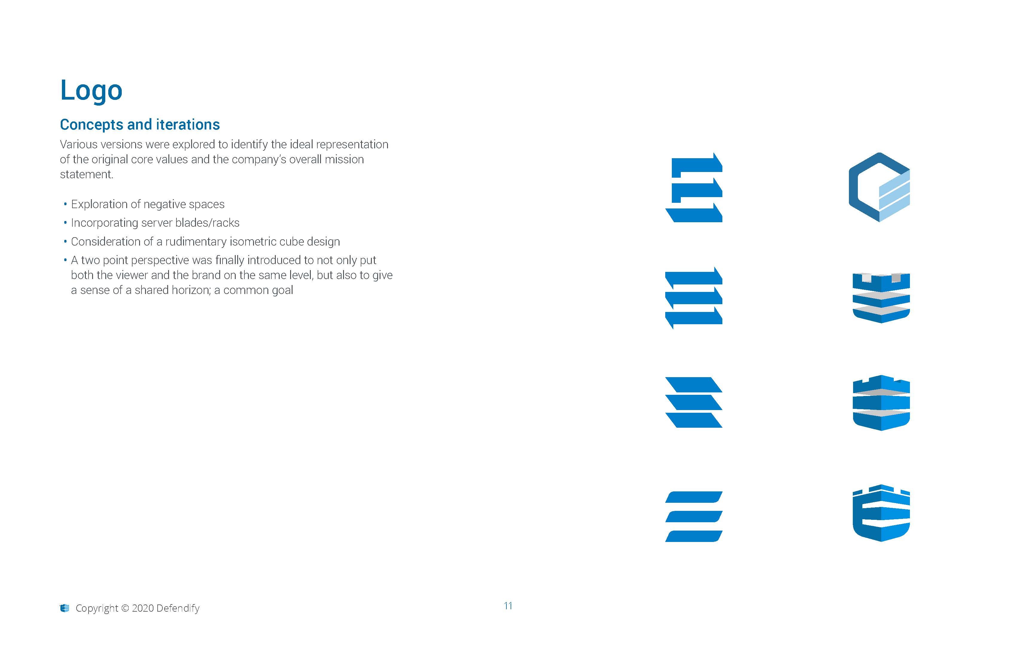
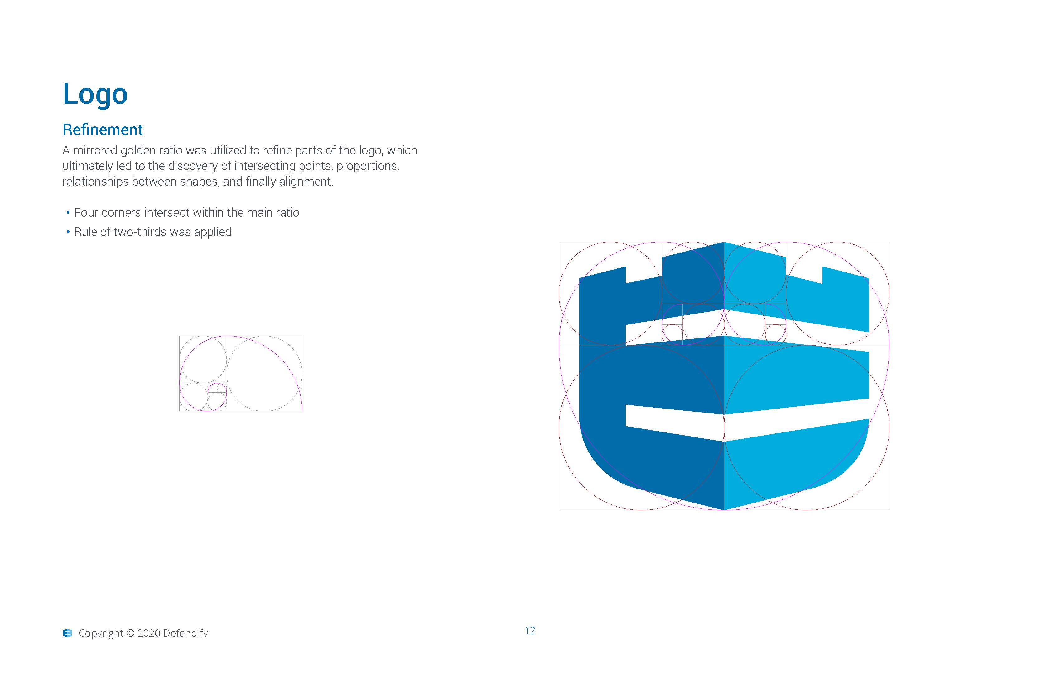
1. Establishing a Clear Visual Language
The first version of the interface leaned heavily on traditional "security tool" visual patterns — dark interfaces, dense text, aggressive visual tone.
This created a sense of danger, not confidence.
I shifted toward:
Clean, warm, modern aesthetic
Accessible color palette
Clear typography hierarchy
Icons that clarified meaning rather than simply decorating UI
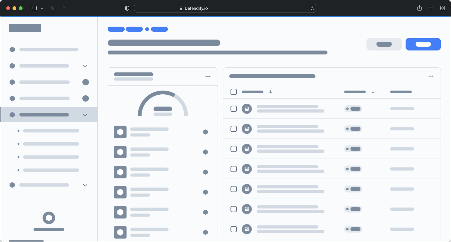
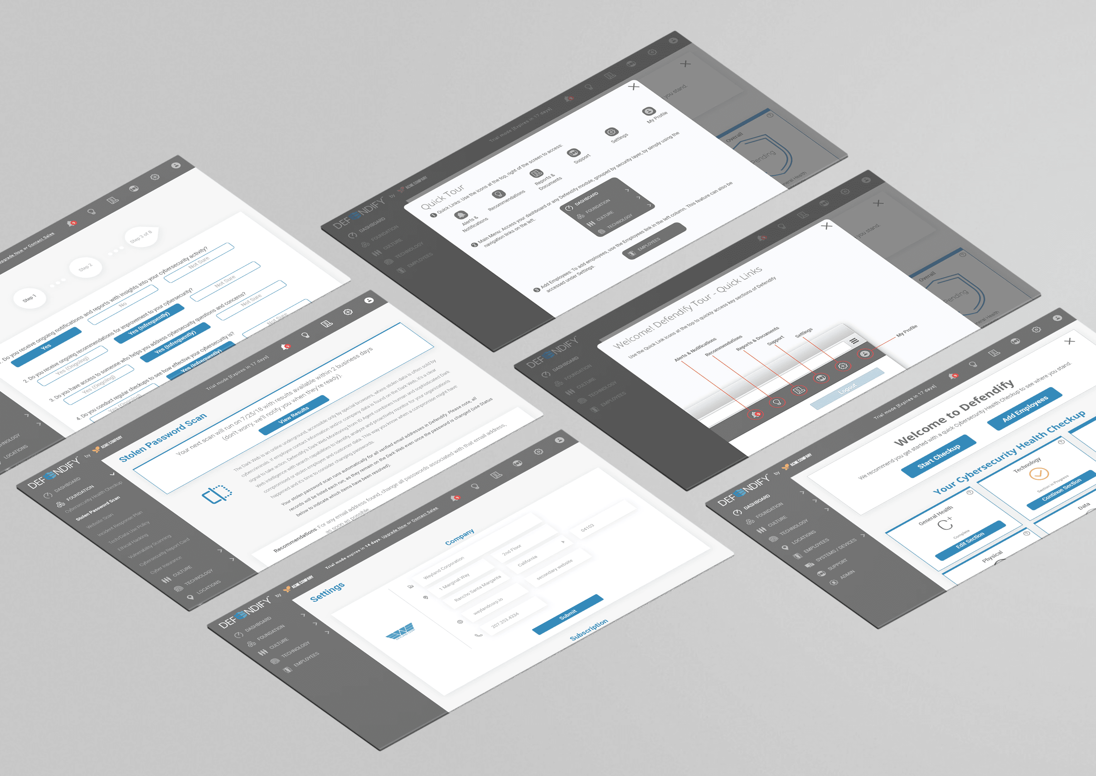
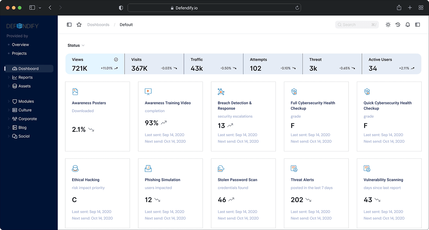
2. Redesigning the Dashboard for Clarity
The dashboard moved from a data-heavy panel to a guided control center.
MVP Challenges:
Complex summaries
No clear prioritization
Cognitive overload
v1.0 Improvements:
Clear “You are here” state of cybersecurity maturity
Actionable next steps grouped by priority level
Simplified navigation based on user tasks, not product categories
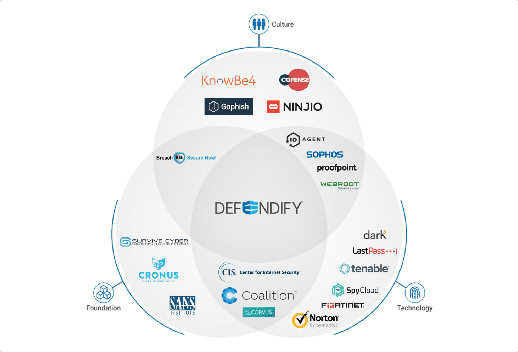
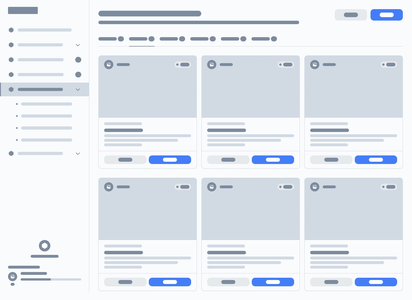
3. Designing the Platform Architecture
Defendify consists of multiple cybersecurity tools spanning:
Risk Assessment
Culture & Awareness Training
Threat Detection & Alerts
Incident Response Resources
The challenge was to organize these as one system, not a pile of tools.
Solution:
Introduced a three-layer architecture communicated visually and conceptually
Foundation
Culture
Technology
This became a core brand and onboarding narrative element.
4. Simplifying the Risk Assessment Experience
Risk assessment workflows are typically long, technical, and painful.
The redesign centered on:
Conversational tone
Progress indicators
Clear explanations adjacent to questions
Breakpoints for saving/returning
[screenshot: Risk Assessment Workflow]
Result: Users reported the assessment felt “like being walked through it, instead of tested.”
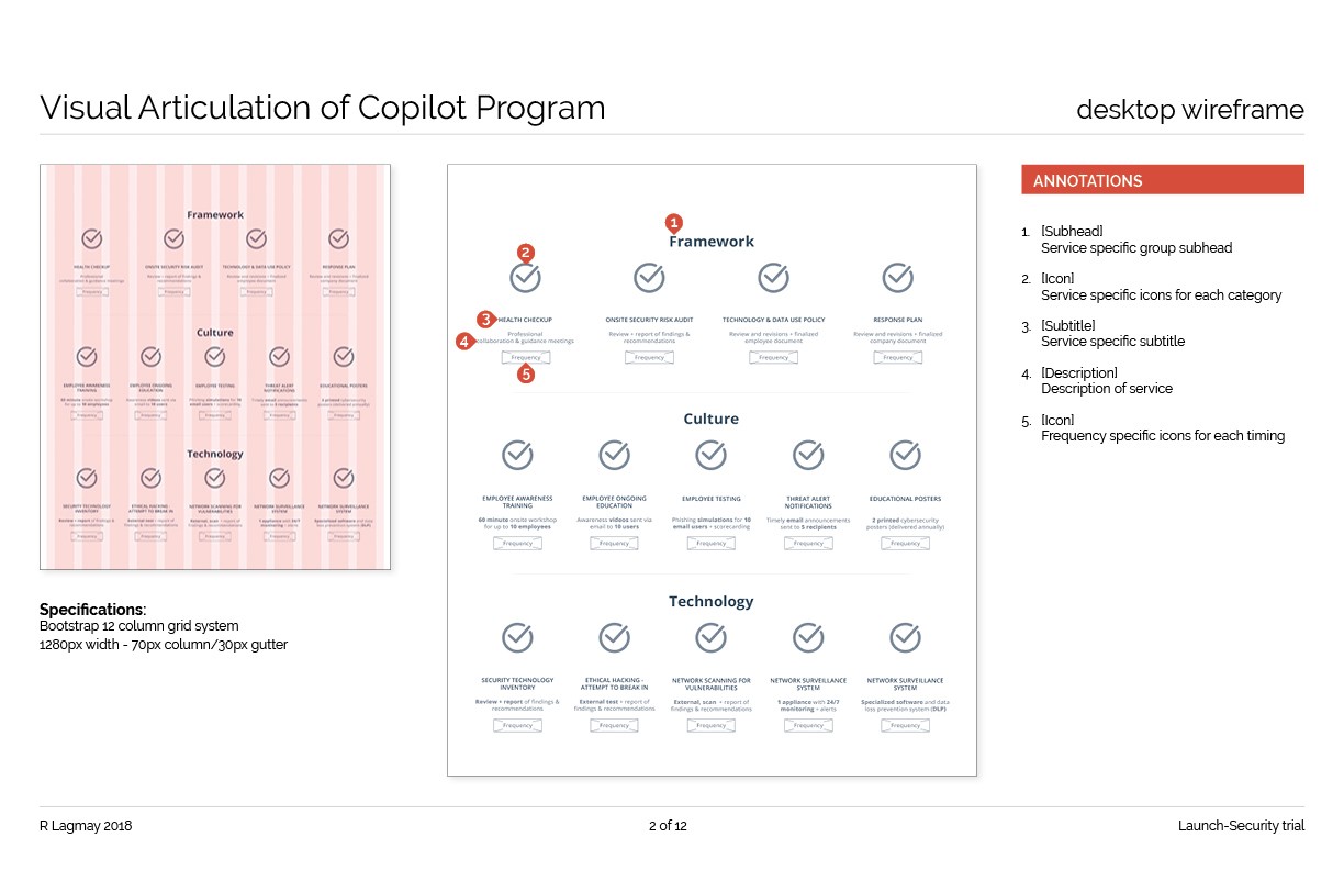
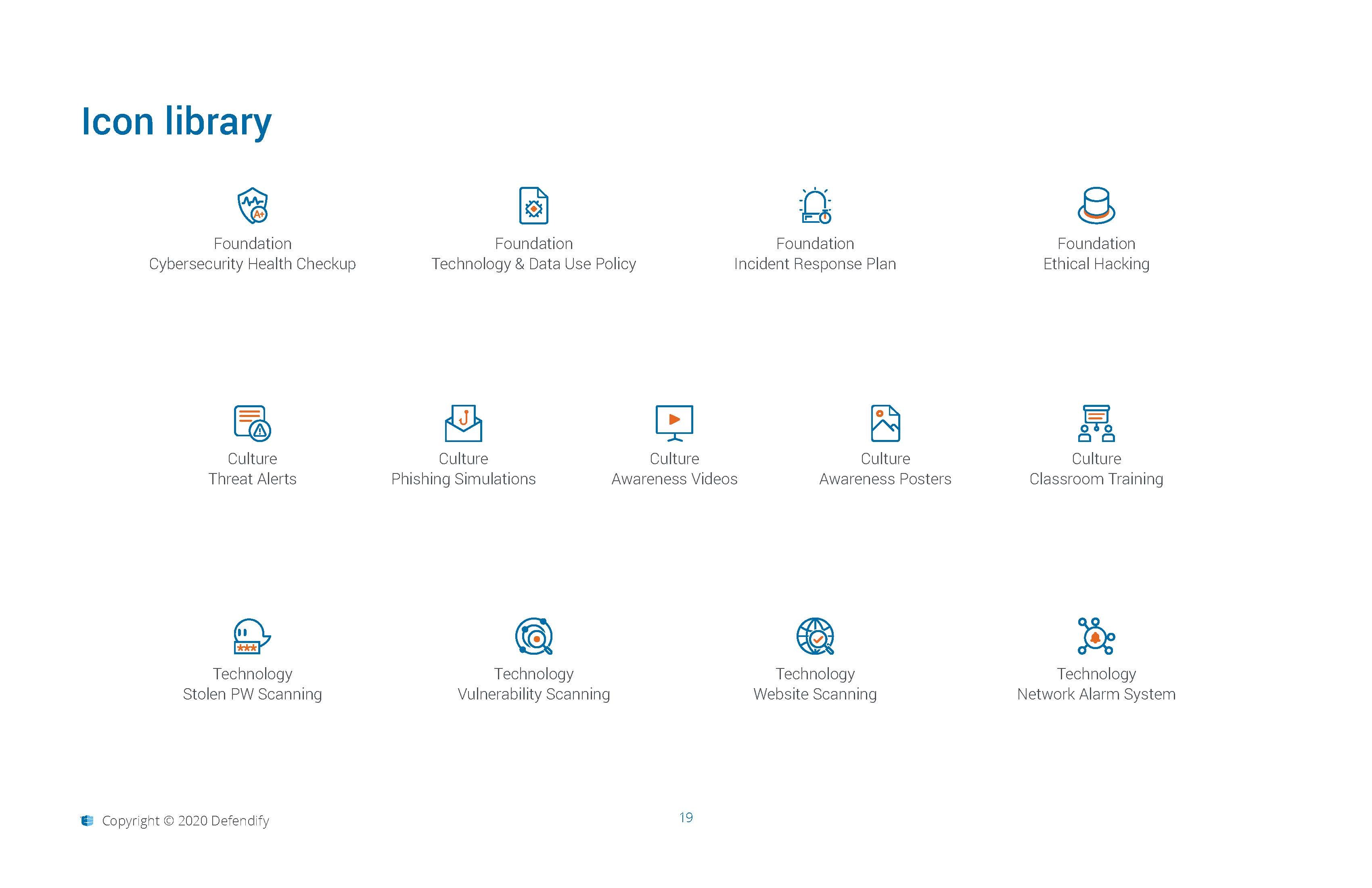
5. Design System & Iconography
I developed the core icon system to visually reinforce:
Meaning
Consistency
Approachability
Later, this expanded into reusable UI components for:
Navigation
Cards
Action prompts
Alerts
Progress indicators
Reflection
This project shaped my perspective on designing for complex domains:
Complexity is not the enemy — confusion is.
The role of design is not just to simplify, but to guide.
Confidence is a UX outcome.
The most meaningful feedback came not from metrics, but from a user who said:
“This is the first time cybersecurity made sense to me.”